
金融科技与加密货币
Kraken
加密交易平台,采用紫色点缀深色 UI 和高密度数据仪表盘。
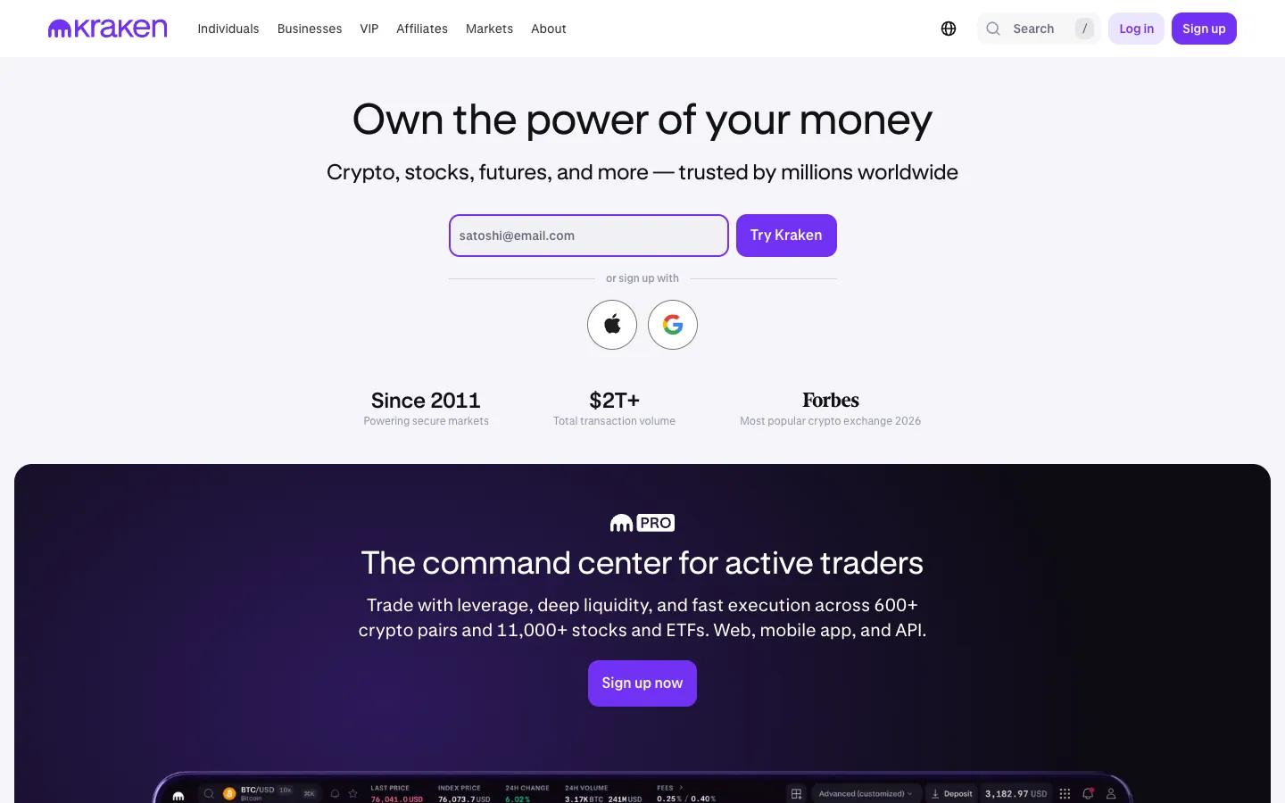 Kraken
官方网站首屏截图,采集于 2026-07-28;点击图片访问原站。页面与其中品牌资产版权归对应权利人所有。
文档许可
这份 DESIGN.md 依 MIT 许可随固定上游版本收录,可阅读与复制;请保留许可与来源信息。
固定上游版本
664b3e78fd1a298ba11973822da988483256d4b4
品牌资产归属
本项目经明确授权保存截图用于灵感索引;品牌名、商标、Logo、专有字体、截图和摄影仍归各自权利人所有,不属于 DESIGN.md 的 MIT 许可范围。
来源与延伸阅读
这是一份社区从公开网站提取的设计分析,不是品牌方发布的官方规范。使用前请回到来源核对当前状态。
原始文档
DESIGN.md
# Design System Inspired by Kraken

## 1. Visual Theme & Atmosphere

Kraken's website is a clean, trustworthy crypto exchange that uses purple as its commanding brand color. The design operates on white backgrounds with Kraken Purple (`#7132f5`, `#5741d8`, `#5b1ecf`) creating a distinctive, professional crypto identity. The proprietary Kraken-Brand font handles display headings with bold (700) weight and negative tracking, while Kraken-Product (with IBM Plex Sans fallback) serves as the UI workhorse.

**Key Characteristics:**
- Kraken Purple (`#7132f5`) as primary brand with darker variants (`#5741d8`, `#5b1ecf`)
- Kraken-Brand (display) + Kraken-Product (UI) dual font system
- Near-black (`#101114`) text with cool blue-gray neutral scale
- 12px radius buttons (rounded but not pill)
- Subtle shadows (`rgba(0,0,0,0.03) 0px 4px 24px`) — whisper-level
- Green accent (`#149e61`) for positive/success states

## 2. Color Palette & Roles

### Primary
- **Kraken Purple** (`#7132f5`): Primary CTA, brand accent, links
- **Purple Dark** (`#5741d8`): Button borders, outlined variants
- **Purple Deep** (`#5b1ecf`): Deepest purple
- **Purple Subtle** (`rgba(133,91,251,0.16)`): Purple at 16% — subtle button backgrounds
- **Near Black** (`#101114`): Primary text

### Neutral
- **Cool Gray** (`#686b82`): Primary neutral, borders at 24% opacity
- **Silver Blue** (`#9497a9`): Secondary text, muted elements
- **White** (`#ffffff`): Primary surface
- **Border Gray** (`#dedee5`): Divider borders

### Semantic
- **Green** (`#149e61`): Success/positive at 16% opacity for badges
- **Green Dark** (`#026b3f`): Badge text

## 3. Typography Rules

### Font Families
- **Display**: `Kraken-Brand`, fallbacks: `IBM Plex Sans, Helvetica, Arial`
- **UI / Body**: `Kraken-Product`, fallbacks: `Helvetica Neue, Helvetica, Arial`

### Hierarchy

| Role | Font | Size | Weight | Line Height | Letter Spacing |
|------|------|------|--------|-------------|----------------|
| Display Hero | Kraken-Brand | 48px | 700 | 1.17 | -1px |
| Section Heading | Kraken-Brand | 36px | 700 | 1.22 | -0.5px |
| Sub-heading | Kraken-Brand | 28px | 700 | 1.29 | -0.5px |
| Feature Title | Kraken-Product | 22px | 600 | 1.20 | normal |
| Body | Kraken-Product | 16px | 400 | 1.38 | normal |
| Body Medium | Kraken-Product | 16px | 500 | 1.38 | normal |
| Button | Kraken-Product | 16px | 500–600 | 1.38 | normal |
| Caption | Kraken-Product | 14px | 400–700 | 1.43–1.71 | normal |
| Small | Kraken-Product | 12px | 400–500 | 1.33 | normal |
| Micro | Kraken-Product | 7px | 500 | 1.00 | uppercase |

## 4. Component Stylings

### Buttons

**Primary Purple**
- Background: `#7132f5`
- Text: `#ffffff`
- Padding: 13px 16px
- Radius: 12px

**Purple Outlined**
- Background: `#ffffff`
- Text: `#5741d8`
- Border: `1px solid #5741d8`
- Radius: 12px

**Purple Subtle**
- Background: `rgba(133,91,251,0.16)`
- Text: `#7132f5`
- Padding: 8px
- Radius: 12px

**White Button**
- Background: `#ffffff`
- Text: `#101114`
- Radius: 10px
- Shadow: `rgba(0,0,0,0.03) 0px 4px 24px`

**Secondary Gray**
- Background: `rgba(148,151,169,0.08)`
- Text: `#101114`
- Radius: 12px

### Badges
- Success: `rgba(20,158,97,0.16)` bg, `#026b3f` text, 6px radius
- Neutral: `rgba(104,107,130,0.12)` bg, `#484b5e` text, 8px radius

## 5. Layout Principles

### Spacing: 1px, 2px, 3px, 4px, 5px, 6px, 8px, 10px, 12px, 13px, 15px, 16px, 20px, 24px, 25px
### Border Radius: 3px, 6px, 8px, 10px, 12px, 16px, 9999px, 50%

## 6. Depth & Elevation
- Subtle: `rgba(0,0,0,0.03) 0px 4px 24px`
- Micro: `rgba(16,24,40,0.04) 0px 1px 4px`

## 7. Do's and Don'ts

### Do
- Use Kraken Purple (#7132f5) for CTAs and links
- Apply 12px radius on all buttons
- Use Kraken-Brand for headings, Kraken-Product for body

### Don't
- Don't use pill buttons — 12px is the max radius for buttons
- Don't use other purples outside the defined scale

## 8. Responsive Behavior
Breakpoints: 375px, 425px, 640px, 768px, 1024px, 1280px, 1536px

## 9. Agent Prompt Guide

### Quick Color Reference
- Brand: Kraken Purple (`#7132f5`)
- Dark variant: `#5741d8`
- Text: Near Black (`#101114`)
- Secondary text: `#9497a9`
- Background: White (`#ffffff`)

### Example Component Prompts
- "Create hero: white background. Kraken-Brand 48px weight 700, letter-spacing -1px. Purple CTA (#7132f5, 12px radius, 13px 16px padding)."
复制时请同时保留 MIT 许可、固定 commit 与社区参考边界。